Page Templates
Overview
Page layout templates are pre-built pages that can be utilized for quickly creating a various types of product pages.
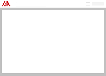
One-Column Fluid
A one column fluid layout utilizes a single tile that grows and shrinks according to the browser window size.
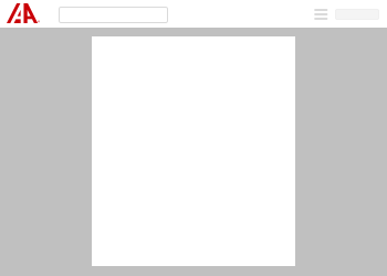
One-Column Max Width
A one column max width layout utilizes a single tile that grows according to the browser window but has a maximum width defined which prevents it from growing after that defined width.
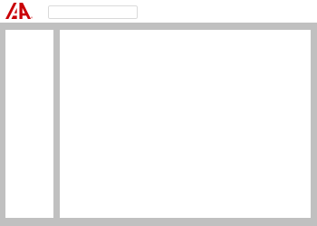
Two-Column Fluid
A two column fluid layout grows according to the width of the browser, however one column is fixed and maintains the same width as the other column adjusts.
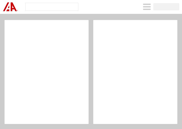
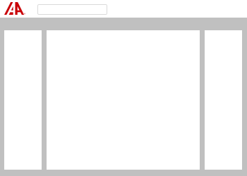
Two Column Max Width
The two column max width layout is very similar to the two column fluid layout except that two columns stay centered and no longer adjust after a certain defined maximum width.
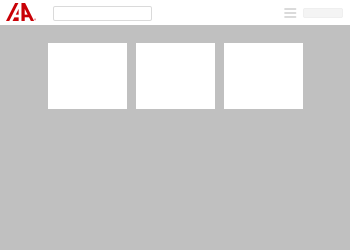
Three Column Fluid
Similar to the other fluid layouts, the width will adjust according to the width of the browser, however, the middle column is the only area that adjusts. The outside columns maintain the same defined width regardless.
Three Column Max Width
The three column max width behaves like the other max-width layouts, however, the three columns have equal variable widths that stop growing at the defined max width.
Container Size
| Size | Max. Width | Code Differentiation |
|---|---|---|
| Standard | Fluid | No Class Required |
| Small | 70rem/700px | container-sm |
| Medium | 100rem/1000px | container-md |
| Large | 130rem/1300px | container-lg |
| Extra Large | 160rem/1600px | container-xl |
Tile Size
| Size | Max. Width | Code Differentiation |
|---|---|---|
| Standard | Fluid | No Class Required |
| Small | 30rem/300px | tile-sm |
| Medium | 40rem/400px | tile-md |
| Large | 60rem/600px | tile-lg |
| Extra Large | Fluid | tile-xl |