Display
Overview
Quickly and responsively change the display value of components. Includes support for the most common values.
Changing Display
Set any element’s display property to block, inline, or inline-block.
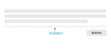
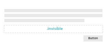
Hiding Elements
There are two options for hiding elements .hidden and .invisible. With the .invisible class the element will still occupy its space on the page.
Responsive Display
For faster mobile-friendly development, use these responsive display classes to show or hide an element on any breakpoint.
There are two types of classes .hidden-*-up and .hidden-*-down. The .hidden-*-up classes will hide the element when the viewport is at a given breakpoint or wider. For example, .hidden-md-up will hide an element on medium, large, and extra-large viewports. The .hidden-*-down classes work the same but in the opposite way, they will hide the element when the breakpoint is smaller. Additionally, you can combine a .hidden-*-up class and a .hidden-*-down class to show an element only on a given interval of screen sizes. For example, .hidden-sm-down .hidden-xl-up shows the element only on medium and large viewports.
Extra Small(<544px) |
Small(≥544px - <768px) |
Medium(≥768px - <992px) |
Large(≥992px - <1200px) |
Extra Large(≥1200px) |
|
|---|---|---|---|---|---|
| .hidden-xs-down | hidden | visible | visible | visible | visible |
| .hidden-sm-down | hidden | hidden | visible | visible | visible |
| .hidden-md-down | hidden | hidden | hidden | visible | visible |
| .hidden-lg-down | hidden | hidden | hidden | hidden | visible |
| .hidden-xl-down | hidden | hidden | hidden | hidden | hidden |
| .hidden-xs-up | hidden | hidden | hidden | hidden | hidden |
| .hidden-sm-up | visible | hidden | hidden | hidden | hidden |
| .hidden-md-up | visible | visible | hidden | hidden | hidden |
| .hidden-lg-up | visible | visible | visible | hidden | hidden |
| .hidden-xl-up | visible | visible | visible | visible | hidden |