Buttons
General Guidelines
Buttons are used primarily on action items. Some examples include:
- Add
- Save
- Delete
- Login
Do not use Buttons as navigational elements. Instead, use Links because it takes the user to a new page and is not associated with an action.
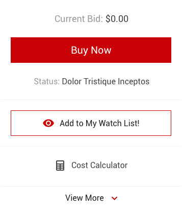
Primary Buttons
Each page may have one to two primary Buttons. Any remaining actions that need to be represented shall be done with other Button types such as secondary, tertiary, or cancel/remove Buttons.
Placement
Buttons should be placed in close proximity to the elements that they are related to so that the user understands their relation.
- Side-by-side Buttons - Related Buttons can be placed side-by-side with 20rem of spacing between them.
-
Stacking Buttons - When a solution requires two related Buttons to be placed near each other, and one or both the Buttons have long labels that prevent the Buttons from being placed side-by-side, then the Buttons should be stacked on top of one another with 20rem of spacing between them.
Hiding Buttons
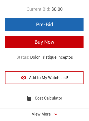
Buttons can be hidden when a scenario is presented to the user in which the Buttons are not relevant. For example, in the native buyer app, on the vehicle details page (VDP), when prebidding is no longer available for a particular stock because it is getting ready to go for sale in a live auction, we remove the Prebid Button from the VDP’s action area so that the user is clear that prebidding is no longer available.
Hierarchy
Buttons should be used to establish a clear layout hierarchy. The primary action/Button is considered the most important action in a layout and will have more visual emphasis over any content or interactive element. The primary action will make it clear that other content in the layout is less important.
Labeling
A Button label should describe the action that will occur if a user clicks/taps the Button. For example, a Button that submits a payment for items when it is clicked should be labeled “Submit payment”
As for casing, labelling should always be done in sentence case (e.g. “Submit form”), unless the label includes a proper noun in which the labelling should be initial cap case (e.g. “Bid Live”).
Mobile Buttons
When using Buttons in mobile solutions, consider using slightly larger touchpoints of at least 44rem x 44rem, which is a general guideline for mobile Button size.
Usage
| Button Type | Purpose |
|---|---|
| Primary | For the principle call to action on the page. Examples of principle calls to action would be Send, Submit, and Confirm Buttons in solutions in which these are the desired actions on the page. |
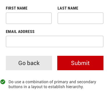
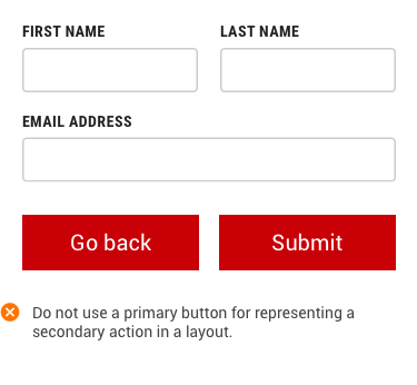
| Secondary | For actions that are defined as secondary, that is, actions that are less important than the primary action. Secondary Buttons may include Edit, Go Back, and Close Buttons. |
| Tertiary | When an action does not require primary or secondary dominance on the page. |
| Ghost | For actions that require further visual downplay from a Tertiary button. These buttons do not have a border, and are typically supported with iconography. |
| Button with icon |
Icons can be used in Buttons to reinforce the user’s interpretation of the resulting action of clicking the Button. Icons can help better communicate what the Button does. Icons are almost always paired with text, however, there are exceptions for very common user actions, such as pencil icons for edit Buttons, crosses/x’s for close Buttons, and left-arrow icons for back Buttons. These types of common and globally understood icons may be used without labels. Icons should be sized to the height of the label or text that it’s paired with. |
| Button with Dropdown Menu | Use a Button with a drop down menu when there are multiple actions available but UI real estate is a concern. When organized properly, drop down menus can reduce the visual complexity of the UI. |
| Disabled Button | Disabled Buttons states can be used in two scenarios: 1. When the user cannot proceed until an input is collected, or 2. When the user does not have access to a particular feature/function that is activated by the Button. |
| Set of Buttons |
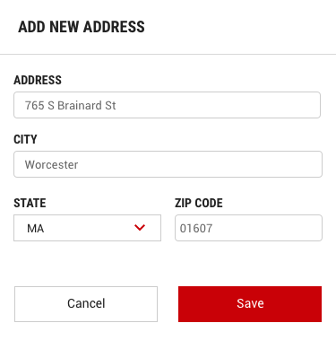
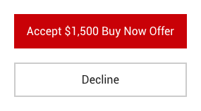
When an action required by the user has more than one option, always use a negative action Button (Cancel/Remove) paired with a positive action Button (primary) in that order. Negative action Buttons should be on the left, and positive action Buttons should be on the right. In scenarios where more than one Button is needed:
|
| Back-to-top Button |
Back-to-top Buttons can be used at the bottom of very long pages so that the user has an easy means getting back to the top of the page. The Button can be made to display in one of the following ways:
Either approach of the Back-to-top Button placement can be considered depending on the solution requirements. |
Button Sizes
The size of a Button is an important factor in distinguishing priority in a user interface. Size is controlled by a specific CSS class which makes it easy to adjust.
Large Buttons
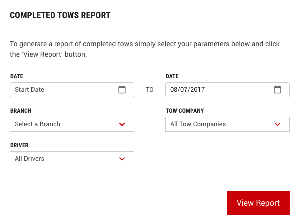
Large Buttons are used primarily for the principle call to actions on a page.
Defining Class Name: btn-lg
Medium (Standard) Buttons
Medium Buttons are the standard size for Buttons in the UI. This size should also be used when pairing a Button with an input control.
Defining Class Name: btn-md

Small Buttons
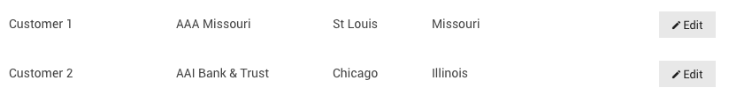
Small Button sizes are used where layout room is an issue or an action has low need of visual prominence. Examples include:
- In-line actions inside a table or list view rows.
- Actions for toolbars.
Defining Class Name: btn-sm