Checkboxes
General Guidelines
Click target
Users should be able to select the Checkbox by clicking on the box directly or by clicking on its label.
Default selection
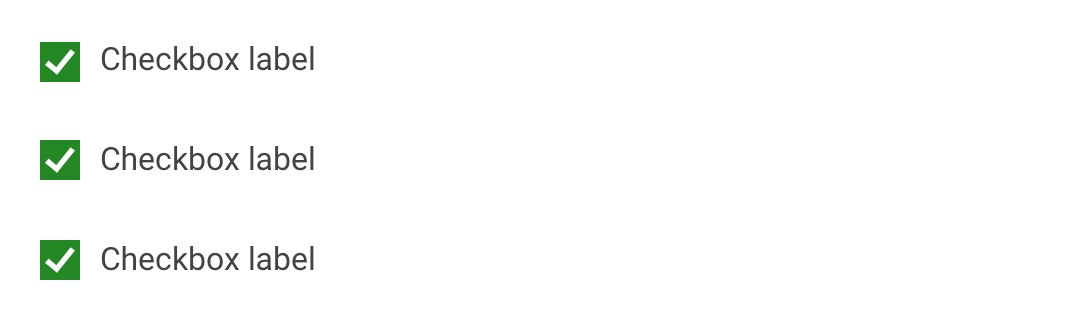
The default view of a set of Checkboxes is having no option selected.
Checkboxes checked but disabled
Checkboxes checked but disabled should be used sparingly because they can add confusion.
When to use:
- When you need to display all available options, but some can't be changed because of access permissions.
- When you need to present a list of available options, but some are unchangeable because they're default states.
- When the user already made preferences based on selections and we want to present all list items. In order to unselect those options needs to use a "change" option on their preference list.
In all cases, it is recommended to provide clarity around checked but disabled Checkboxes. Users should not be made to make assumptions about why some actions are restricted for them.
Anatomy
The Checkbox component contains a Checkbox label and a Checkbox input. A grouping label can be added if there is a need for better clarification on what is expected by making Checkboxes selections.
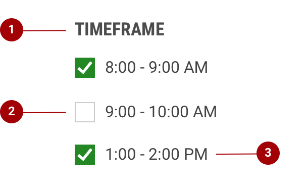
- Grouping Label - If necessary, a label can accompany a set of Checkboxes to provide further context or clarity.
- Checkbox Input - A Checkbox input indicates the appropriate state.
- Checkbox Label - A Checkbox label appears to the right of the Checkboxes and should be clear, concise, and explicit about the actions that will follow if the Checkbox is selected.
Do's and Don'ts
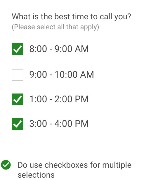
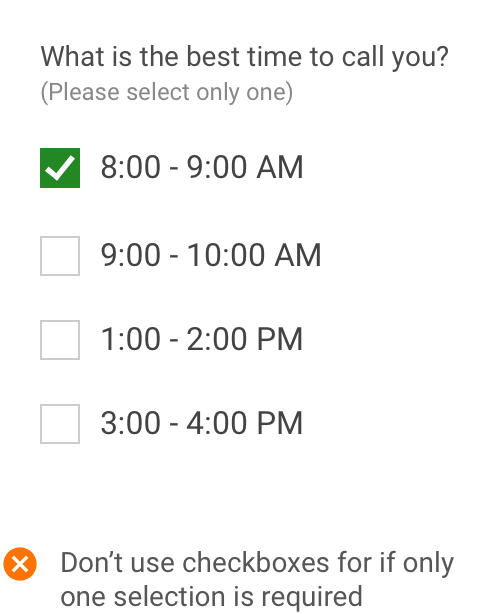
Use Checkboxes when a user is able to make single or multiple selections. If a user is restricted only to one selection then use radio butons.
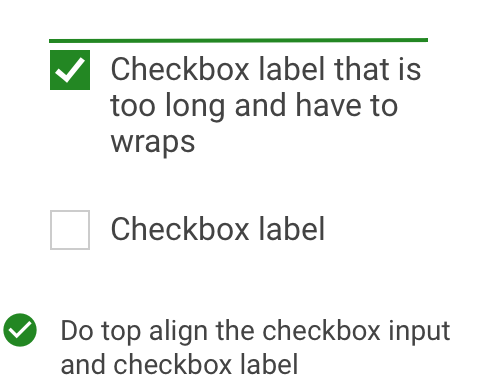
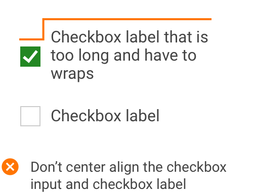
The Checkbox label can be wrapped. Checkbox input and label should be top aligned. Don't vertically center the Checkbox label with the input.
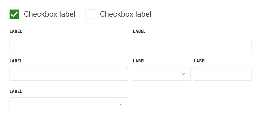
Positioning
There should be flexibility around Checkbox positioning depending on layout and other variables. The default arrangement for checkboxes should be to stack them vertically for easier readability. An example of a scenario in which horizontal arrangement can be used is when there are 2 to 3 Checkboxes included within an input form.