- Overview
- General Guidelines
- Data Table Section Guidelines
- Data Table Behaviors
- Mobile Best Practices
- Advanced Data Functionality
Overview
The Data Table's features are ideal for organizing and displaying data in a UI. The column headers can sort data in ascending or descending order, rows can be expanded to progressively disclose information, and single or batch actions can be taken on rows.
The Data Table toolbar gives a location for primary buttons, search, filtering, table display settings, and other utilities.
When to use
- To organize and display data that needs to be compared against each other.
When not to use
- As a replacement for a spreadsheet application. Instead give the user the ability to download a .csv or .xls file
-
When the content needs visual hierarchy or a more complex layout or when interactions are required. In this case, utilize a Data Table item.
- A Data Table gives more flexibility and control of the data across different form factors.

Data Table Types
Standard Data Table
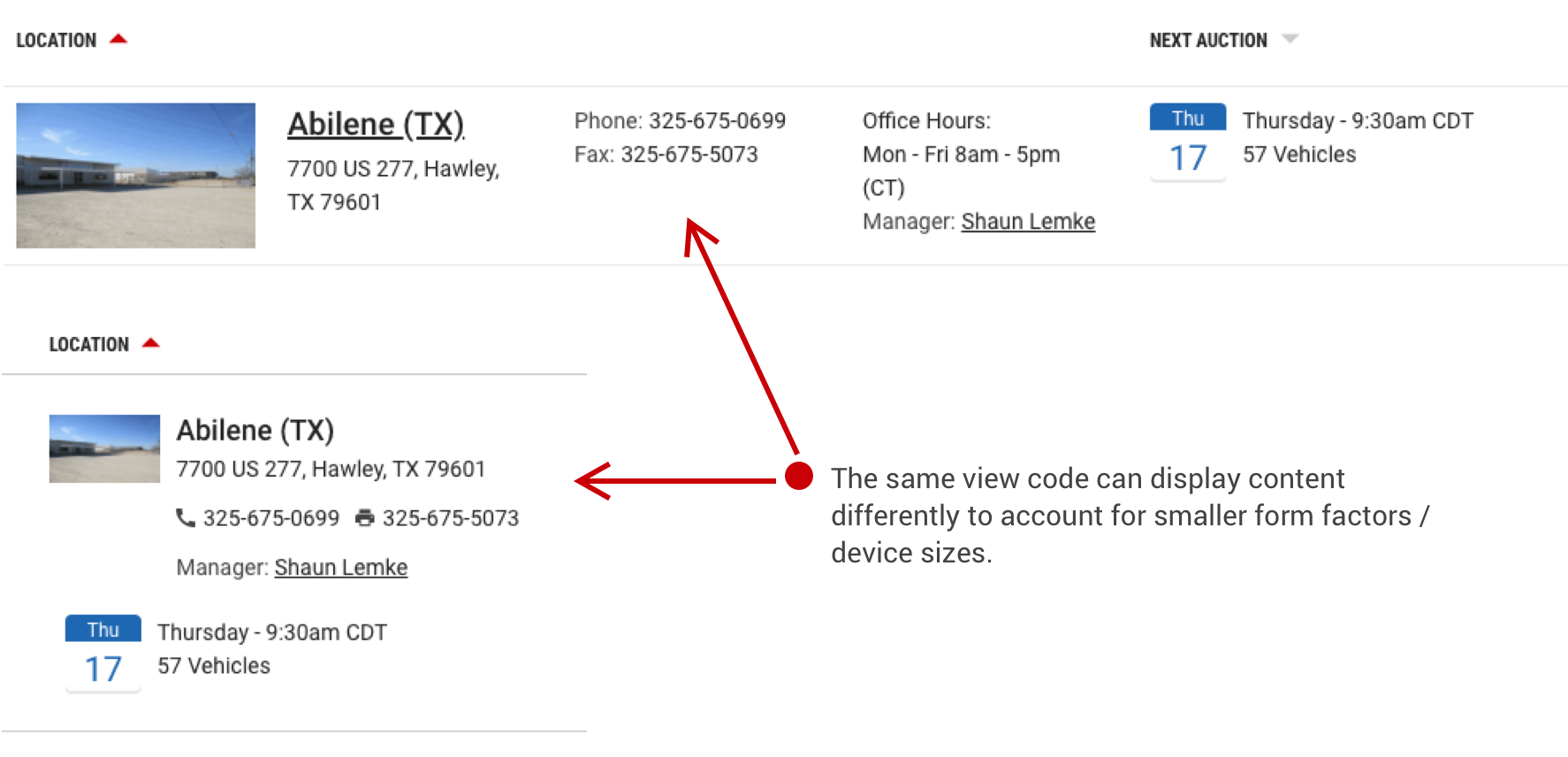
The Data Table component uses a rigid column and row layout for presenting data. It is very dependent on horizontal space to show additional data.

Flexible Data Tables
The Flexible Data Table component uses flexible containers to display data, which can be controlled as the browser width changes. This approach is preferred for adaptive or responsive layouts.
General Guidelines
Prioritize Your Data
Tables with lots of data can be problematic for trying to easily access data or actions. Tables must display content horizontally and can frequently overflow content out of view. Prioritizing your data left to right can ensure that the most important data is easily accessible. Also, consider using a feature that allows you to break up your primary and secondary data.

Be Concise
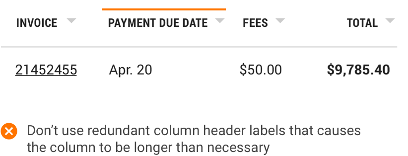
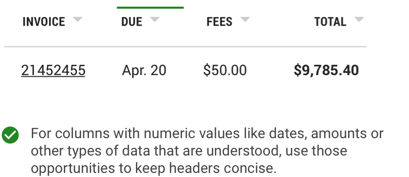
Column headers need to be concise in order to maximize readability in your table. Avoid providing redundant labels for dates, monetary values and unit numbers.
Placement
Data Tables should be placed in a page’s main content area and given plenty of space to display data without truncation. Avoid placing Data Tables inside modals or smaller containers where the information can feel cramped or needs truncation.
The container that a table lives in should only be as wide as its content. With a simple table, the container should help emphasize its simplicity.

For Data Tables with much more content and columns, a full width container will likely be needed to serve up the content in a readable usable format.

Anatomy
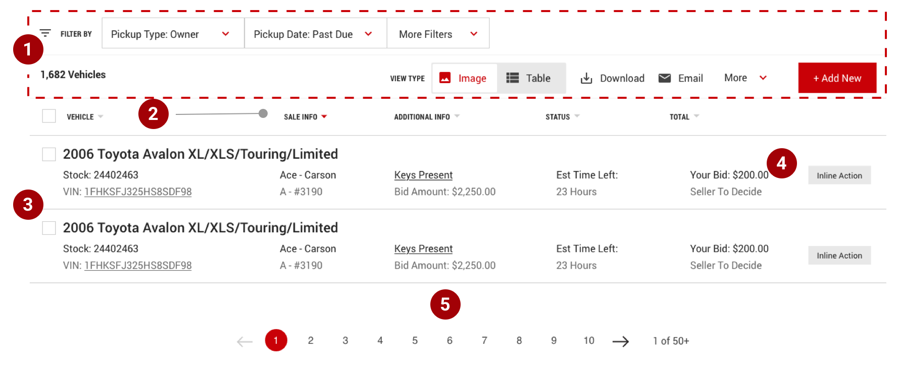
- Toolbar - global controls including filters, settings, primary button, result count and other features.
- Column Headers - title for the row with optional sorting features and optional select all control when batch actions are needed.
- Table Row - rows can be customized based on complexity of content using traditional table columns or using custom list items where layout can be controlled as device width changes.
- Inline action - each row may have an inline action which is always placed the far right column.
- Pagination - an optional component that allows users to navigate data as different pages when the amount of data is too large to be shown all at once.
Data Table Section Guidelines
Table Toolbar
The table toolbar is reserved for global table controls such as search, settings, filters or export of table data.

- Filters and/or Search - any control that reduces the result count A “Saved Search” feature is still considered a filter.
- Total Count - Number of items in the list (including all pages if pagination is utilized).
- Sort by controls - when column sorting is not available, then custom sort by controls can paired along with optional secondary controls.
- Primary Button / Action - This is the main action / purpose for the page used when there is just one batch action available.
- Secondary features - These are features that are prioritized as less critical. They typically don’t affect the results and are intended to enhance what the user can do with the data set, like download, share, etc.


Column Headings

- Concise Headings - Column headings should stick to one or two words that describe the data in that column. Being concise helps readability of the data and optimizes the layout.
- Wrap Text - In cases where a column title is too long, wrap the text to two lines.
- Using Tool tips - If necessary, truncate the rest of the text. The full text should be shown in a tool tip on hover or using the title tag.
Table Rows

- Prioritize Data - Data in each row should be prioritized by importance from left to right.
- Alignment - For rows with multi-select, checkbox controls should always be left aligned before the main data point. Numerical data like money should be right aligned.
- Readability - Zebra striping for rows allows users to easily track data horizontally and is only needed for tables with 5 or more columns.
- Using Buttons - For rows that have a primary action, follow the guidance for primary button usage.
Pagination
Pagination divides a table data into separate pages and only should be used as a solution for when the amount of data is causing performance issues. Follow the guidance for the pagination component in the usage section.

Table Toolbar
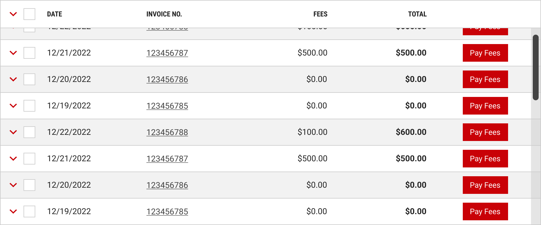
A fixed header for a data table will keep the table’s column heading bar at the top of the browser window while the user scrolls. Use this fixed header if the data table content requires the user to scroll down through the table. This prevents users having to remember what kind of information is in each column.
Sorting
Columns can be sorted in ascending or descending order. Sorting controls are located in the column headers and indicated with a gray arrow icon. Actively sorted columns are indicated by a red arrow icon.

Search
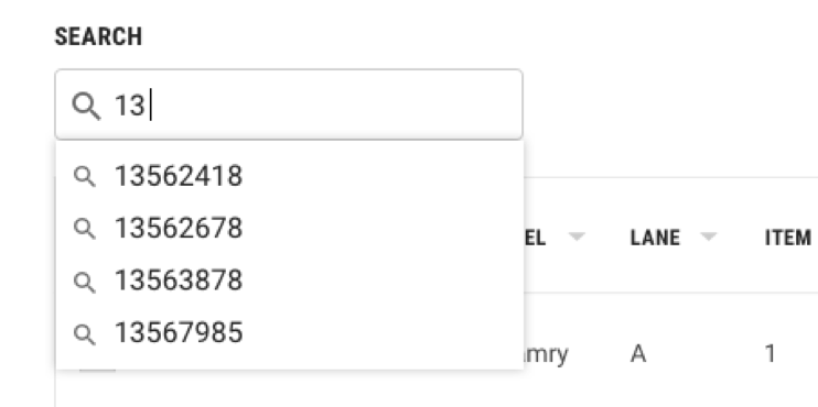
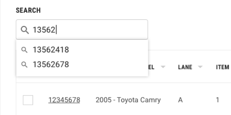
Search is the preferred function for filtering results especially a search that allows the user to search on all data points in the table. The look of the search control can vary depending on its functionality.

Expandable & Selectable Rows
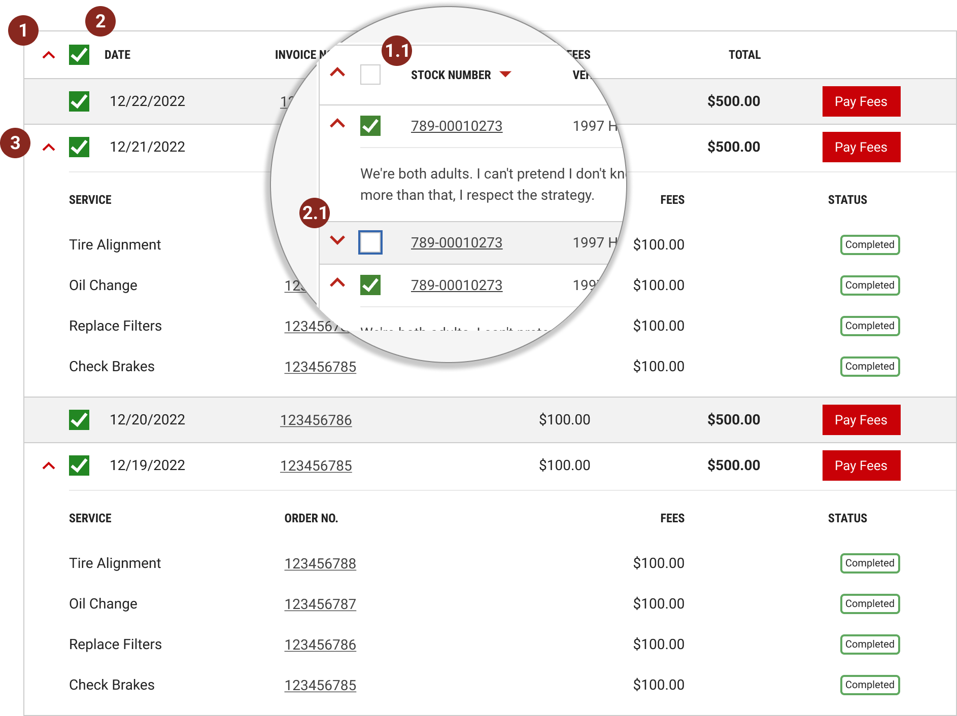
Data tables can be configured to have both expandable and selectable features. The expandable icon always appears first and to the left of the selection icon.
- Expandable Rows - Use the expanded section for supplementary information or data that needs additional loading time. Consider including links or action buttons that take the user to a dedicated page, side panel, or modal to view the information and complete tasks. To expand a row, the user clicks the arrow associated with the row. The user can expand all rows at once by clicking the arrow in the column header. See more about this in [bulk select & expand]. Arrows in the rows have only two states, expand or collapsed.
- Selectable Rows - Users can select a single row to perform a global control featured in the [table toolbar]. They can also select multiple rows to apply bulk actions. To select a row, the user clicks the checkbox associated with the row. The user can select all rows at once by clicking the checkbox in the column header. See more about this in [bulk select & expand]. Checkboxes in the rows have only two states, checked and unchecked. Actions applied to the selected items are found in the bar that appears in [bulk action mode] or [table toolbar].
Bulk Expand & Select
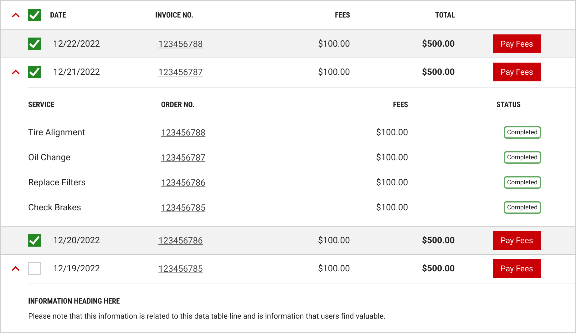
Users can select multiple rows or expand multiple rows by clicking on the icon in the table column header (or parent row). These two actions can be used together or separately. If used together, the expandable icon always appears first and to the left of the selection icon.
-
Bulk Expand - allows the user to open all collapsed sections simultaneously. If there are multiple expandable rows within a table, feature this function in the table column header.
- Interaction Design - if a user collapses a row after clicking on the bulk expand arrow, the arrow will remain pointing down. The only time the arrow points up again is when the user clicks the column header bulk expand button.
-
Bulk Select - allows the user to select all check boxes within the table simultaneously. If there are multiple rows in a table with check boxes, feature this function in the table column header.
- Interaction Design - if a user deselects a row after clicking on the bulk select box, the green check mark will disappear from the column header bar. Similarly, if a user checks all the boxes, the column header checkbox should have the green check mark.
- Expanded Row Selection - check boxes within an expandable row should only be selected during bulk select if the row is already expanded.
Bulk Action Mode
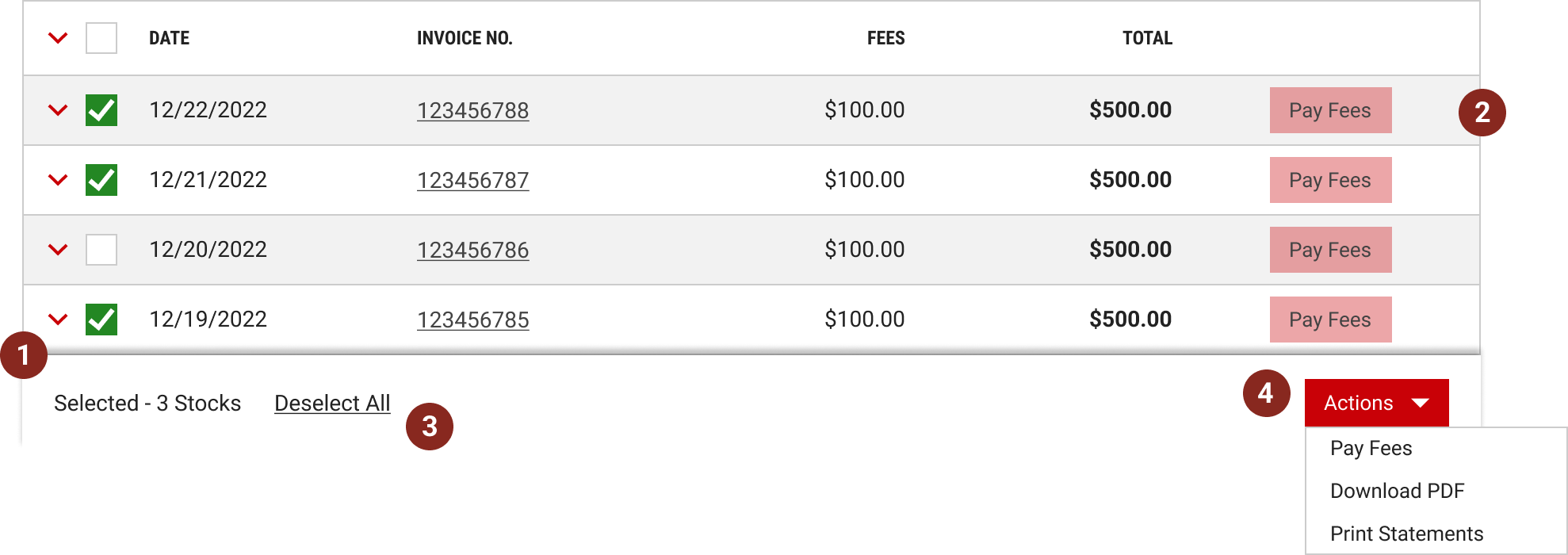
Users can perform bulk actions on one or more items within a table. The Bulk action mode becomes active when one or more item in the table (or expandable row, if applicable) is selected.
- The bulk action bar animates up at the bottom of the table, presenting a set of possible actions to apply to all select items. This feature increases user efficiency, allowing them to avoid performing the same inline action across multiple table items.
- When the bulk action bar is active, action icons on the row should be disabled.
- To exit the bulk action mode, the user can deselect all items.
- The actions button can contain multiple actions for the selected items.

Mobile Best Practice
- Keep table content to a minimum to prevent horizontal scrolling. Use list views to stack content so all data is in view.
- When a data table is required and it bleeds outside the device’s width, anchoring the first column will help the user track the data according to the primary data point.
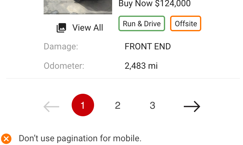
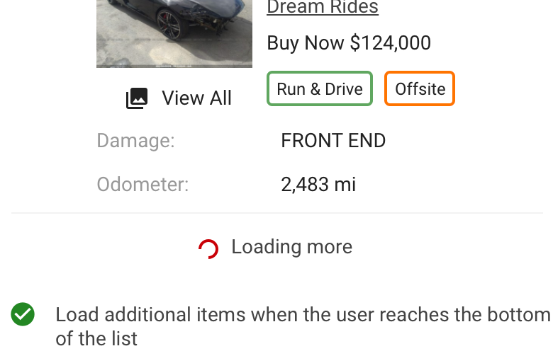
- If performance issues exist, consider using dynamic loading methods to prevent users from having to deal with the details of a pagination control which are not conducive for touch devices.
Advanced Data Functionality
For products that need even more functionality to their Data Tables, Kendo UI offers a library with built in features such as frozen or draggable columns and advanced filtering.
For documentation and examples on implementation of the Kendo UI Data Table, please visit the following links:
- ASP.net MVC
https://demos.telerik.com/aspnet-mvc/grid - JQuery
https://demos.telerik.com/kendo-ui/grid/index - Additional platforms
https://www.telerik.com/kendo-ui
Overview
The Data Table's features are ideal for organizing and displaying data in a UI. The column headers can sort data in ascending or descending order, rows can be expanded to progressively disclose information, and single or batch actions can be taken on rows.
The Data Table toolbar gives a location for primary buttons, search, filtering, table display settings, and other utilities.
When to use
- To organize and display data that needs to be compared against each other
When not to use
- As a replacement for a spreadsheet application. Instead give the user the ability to download a .csv or .xls file
-
When the content needs visual hierarchy or a more complex layout or when interactions are required. In this case, utilize a Data Table item.
- A Data Table gives more flexibility and control of the data across different form factors.

General Guidelines
Prioritize Your Data
Tables with lots of data can be problematic for trying to easily access data or actions. Tables must display content horizontally and can frequently overflow content out of view. Prioritizing your data left to right can ensure that the most important data is easily accessible. Also, consider using a feature that allows you to break up your primary and secondary data.

Be Concise
Prioritize Your Data
Column headers need to be concise in order to maximize readability in your table. Avoid providing redundant labels for dates, monetary values and unit numbers.


Formatting
Anatomy

- Toolbar - global controls including filters, settings, primary button, result count and other features
- Column Headers - title for the row with optional sorting features and optional select all control when batch actions are needed
- Table Row - rows can be customized based on complexity of content using traditional table columns or using custom list items where layout can be controlled as device width changes
- Inline action - each row may have an inline action which is always placed the far right column
- Pagination - an optional component that allows users to navigate data as different pages when the amount of data is too large to be shown all at once
Placement
Data Tables should be placed in a page’s main content area and given plenty of space to display data without truncation. Avoid placing Data Tables inside modals or smaller containers where the information can feel cramped or needs truncation.
The container that a table lives in should only be as wide as its content. With a simple table, the container should help emphasize its simplicity.

For Data Tables with much more content and columns, a full width container will likely be needed to serve up the content in a readable usable format.

Mobile Best Practice
When considering Data Tables in a small form factor (ie mobile devices) there are important things to consider.
- Keep table content to a minimum to prevent horizontal scrolling. Use list views to stack content so all data is in view
- When table data is required and it bleeds outside the device’s width, anchoring the first column will help the user track the data according to the primary data point
- If performance issues exist, consider using dynamic loading methods to prevent users from having to deal with the details of a pagination control which are not conducive for touch devices


Types
Standard Data Table
The Data Table component uses a rigid column and row layout for presenting data. It is very dependent on horizontal space to show additional data.

Flexible Data Tables
The Flexible Data Table component uses flexible containers to display data, which can be controlled as the browser width changes. This approach is preferred for adaptive or responsive layouts.

Main Content
Table Toolbar
The table toolbar is reserved for global table controls such as search, settings, filters or export of table data.

- Filters and/or Search - any control that reduces the result count A “Saved Search” feature is still considered a filter
- Total Count - Number of items in the list (including all pages if pagination is utilized)
- Sort by controls - when column sorting is not available, then custom sort by controls can paired along with optional secondary controls
- Primary Button / Action - This is the main action / purpose for the page used when there is just one batch action available
- Secondary features - These are features that are prioritized as less critical. They typically don’t affect the results and are intended to enhance what the user can do with the data set, like download, share, etc.
Column Titles
- Column titles should stick to one or two words that describe the data in that column. Being concise helps readability of the data and optimizes the layout
- In cases where a column title is too long, wrap the text to two lines and then truncate the rest of the text. The full text should be shown in a tooltip on hover or using the title tag

Table Rows
- Data in each row should be prioritized left to right
- For rows with multi-select, checkbox controls should always be left aligned before the main data point
- Zebra striping for rows allows users to easily track data horizontally and is only needed for tables with 5 or more columns
- For rows that have a primary action, follow the guidance for primary button usage
Behavior
Pagination
Pagination divides a table data into separate pages and only should be used as a solution for when the amount of data is causing performance issues. Follow the guidance for the pagination component in the usage section.

Sorting
Columns can be sorted in ascending or descending order. Sorting controls are located in the column headers and indicated with an arrow icon. Actively sorted icons are indicated by the arrow icon being red.

Multi-select & Batch Actions
Batch actions are functions that may be performed on multiple items within a table. Once the user selects more than one row from the table, the action bar appears, presenting the user with actions they can take. To hide the batch action bar, the user can “Deselect All” Note: Action bar is not yet included in the library but will be coming soon.

Search
Search is the preferred function for filtering results especially a search that allows the user to search on all data points in the table. The search control can look can vary depending on its functionality.


Table Toolbar
The table toolbar is reserved for global table actions such as table settings, complex filters, exporting, or editing table data.
Table Toolbar


Advanced Data Functionality
For products that are looking to incorporate even more functionality to their Data Tables, such as frozen columns, draggable columns or advanced filtering, Kendo UI offers a library that teams are utilizing. We offer a base style for the Kendo UI Data Table for those teams and products that wish to incorporate this solution.
For documentation and examples on implementation of the Kendo UI Data Table, please visit the following links:
- ASP.net MVC
https://demos.telerik.com/aspnet-mvc/grid - JQuery
https://demos.telerik.com/kendo-ui/grid/index - Additional platforms
https://www.telerik.com/kendo-ui
www.carbondesignsystem.com
Email the IAA Design Team
Panel title
Well, I guess that's it. Parting thoughts of which I have two. First: as I said I'll handle the legacy costs out of my end so you won't have to worry about my guys anymore. Second: the bug. The DEA will do a sweep can't say when, could be any time. But you need to get it out of there sooner rather than later. Alright. Just get the bug, Walter.
Transactional Modal
Are you sure you want to pay for the selected items?
Passive Modal
Payments need to happen 3-5 business days after the vehicle is awarded to you (depending on the branch). If you have any questions please contact your local branch.