Expand / Collapse Control
General Guidelines
Use Expand/Collapse Control to show more information in a specific section.
Anatomy
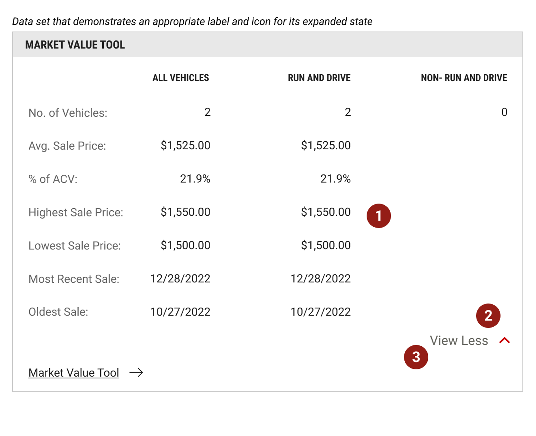
- Showcase Information- Use when there is enough content to condense.
- Visibility- Always indicate the Expand/Collapse Control with a label and icon. The icon needs to be to the right of the label. The call-to-action label and icon are clickable to expand or collapse the content above or below.
- Naming- Labels that accompany the icon should be appropriate to the interaction. An example of this would be “view less” or “view more”.