Modals
Dismissal
Modals may be dismissed in 3 ways:
- Using the “Close” button in the footer of the Modal.
- Pressing the ESC key.
- Clicking / touching outside of the Modal area. Note: If the user is required to answer a question from a transactional Modal in order to continue, you will likely want to disable the ability for the user to dismiss the Modal by clicking/touching outside of the Modal. You can apply that feature by simply changing the following variable: data-backdrop="static" to data-backdrop="boolean".

Structure
Modals have different sizes available to cater to different types of content that needs to be displayed. Below is a summary of the different sizes along with the additional classes that are applied to the <div class=modal-dialog> element.
Header
Include a heading within the Modal that mirrors the action or button that was clicked by the user. Example, if the action button states “Add User” the Modal header should read “Add User”.
Body
The body content within a Modal should be as minimal as possible. Components that may be used in Modals include: Form fields, Text Area, Select, and Radio Buttons.
Footer
The footer area of a Modal typically contains a set of buttons. Refer to Button guidelines for usage.
Size
Modals have different sizes available to cater to different types of content that needs to be displayed. Below is a summary of the different sizes along with the additional classes that are applied to the <div class=modal-dialog> element.
| Size | Max. Width | Code Differentiation | Usage Example |
|---|---|---|---|
| Standard | 64rem/640px | No Class Required |
|
| Small | 48rem/480px | modal-sm |
|
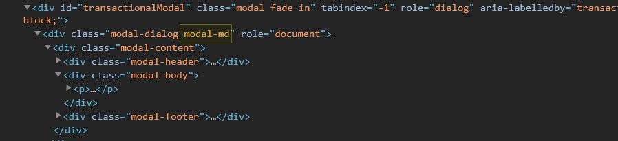
| Medium | 76.8rem/768px | modal-md |
|
| Large | 96rem/960px | modal-lg |
|
| Extra Large | 120rem/1200px | modal-xl |
|
Usage
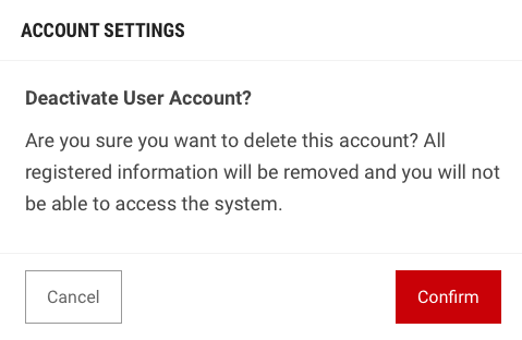
Transactional Modal
Transaction Modals are used to validate user decisions or to gain secondary confirmation from the user. Typically, the Modal requests either a 'yes' or 'no' response.
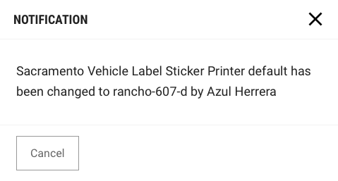
Passive Modal
Passive Modals are used as a style of notifications. We highly discourage the use of this, due to its disruptive nature. Passive Modal notifications should only appear if there is an action the user needs to address immediately. Passive Modal notifications are persistent on-screen. That is, they do not automatically go away after appearing. Users must either engage with or dismiss the notification.
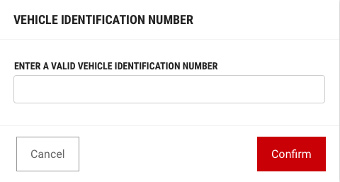
Input Modal
Modals used in this case include input areas that the user may interact with. These may include but are not limited to Forms, Dropdowns, Selectors, and Links.