Popovers
General guidelines
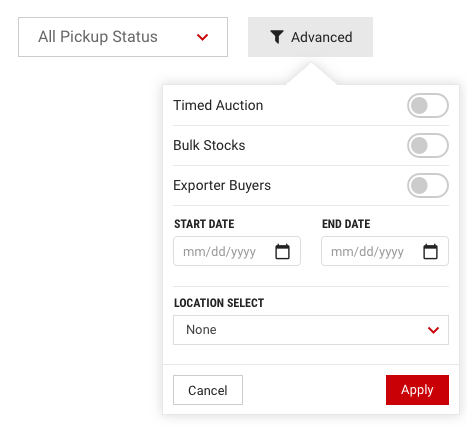
- Should typically be triggered by buttons.
- Content should be concise to get the point across as quickly as possible.
-
Should only contain small amounts of content and/or interactions. If more content is needed, then consider using a modal or panel.
- Great use for Popovers is when actions or content is considered feature discovery.
Location Options
The location of the Popover can be customized to accommodate where the trigger element exists. The default position is Right.
| Position | Attribute |
|---|---|
| Left | data-placement="left" |
| Right (Default) | data-placement="right" |
| Top | data-placement="top" |
| Bottom | data-placement="bottom" |