Segment Control
General Guidelines
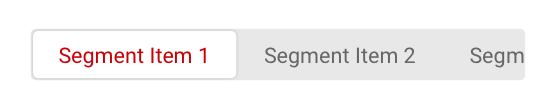
Segment controls have to clearly show and indicate the selected option on the segment at a time. Segment control is a linear set of two or more segments that functions as mutually exlusive buttons.
Default selection
Segment control should have a default selection, which is usually the first segment on the linear bar. Some exceptions apply here depending on user's selection.
When to use
Segment controls are frequently used to let the user's toggle between different formatting, like with a grid view or a table view.
When not to use
When content of the page is divided into related sections, use tabs instead of segment control. Follow guidance for Tabs usage.
Anatomy
The Segment Control component contains active - selected content segment, content segment and text label.
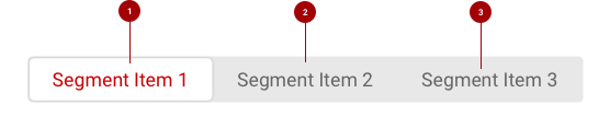
- Active/Selected content segment - Only one content segment can be selected at a time and one option should be always selected.
- Content segment - Selectable container for each content view.
- Text Label - Segment control text label describes the content of a view.
Sizing
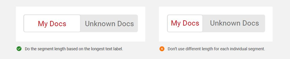
Each individual segment should be the same length. The length of the segments should match the longest text label.
Do’s and Don’ts
Use the longest text label to determine the length of all segments in the segment control bar.
Mobile Use
When using two or more choices on the segment controls of mobile devices or when referring with small/limited real estate, there are a few adjustments that have to be considered:
- Longer words (i.e. Automobiles)
- 2+ word labels (i.e. Available to Public)
- Icon and word labels (i.e. Payment Method)
- Symbol and word labels (i.e. # of Stocks)
Considering the length of these labels for the segments in mobile devices, indicate the need of implementing horizontal segment control slider. This slider will allow user's to slide left or right of the segment control bar, and once user make the selection, the choosen segment will take place in the visable view of the screen along with its content. This slider segment control still have the deafult selection, which is the first segment to the segment control bar.
Behavior
In case where the segment control bar overflows the available real estate, a scrollable slider segment control is embedded