Tabs
General Guidelines
Tabs are used to organize content at the same level of hierarchy and to alternate between views within the same context, without leaving the page. Staying in place while alternating views is the most important point for using the Tabs component. For navigating to different pages follow guidance for Sub Navigation.
When to use
Tabs are used to organize content of similar categories and group items into related sections. Tabs enable users to complete their tasks while swapping between views without navigating away from their workflow.
Tabs shouldn't be used as primary navigation. Don't use Tabs when users need to see content from multiple tabs simultaneously.
Behaviors
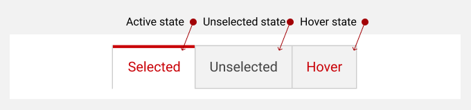
Tabs provide users with visual cues about their location in the experience. Tabs can have four states: active/selected, unselected, hover, and disabled.
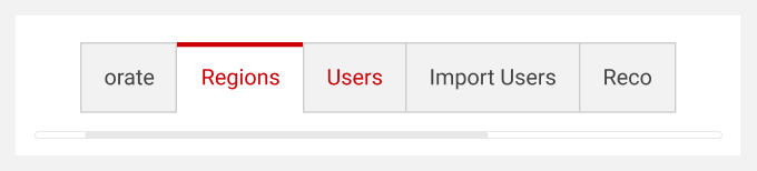
When a page requires more Tab items, or there is limited real estate, the Tab component becomes scrollable.
When a page requires more tab items, or there is limited real estate, the tab component becomes scrollable.
Anatomy
Tab components consist of an item container/box, active indicator line, text label, and content container.
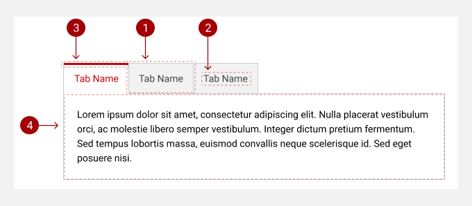
- Item Container/Box - a rectangular frame container for each Tab's text label and line indicator.
- Text Label - clearly describes/represents the content of each Tab item.
- Indicator Line - The indicator line provides visual cues of the current active state of the page content in view.
- Content Container - The content container is attached frame to the Tab bar and displays one content at a time although all tabs are visible.
Do's and Don'ts
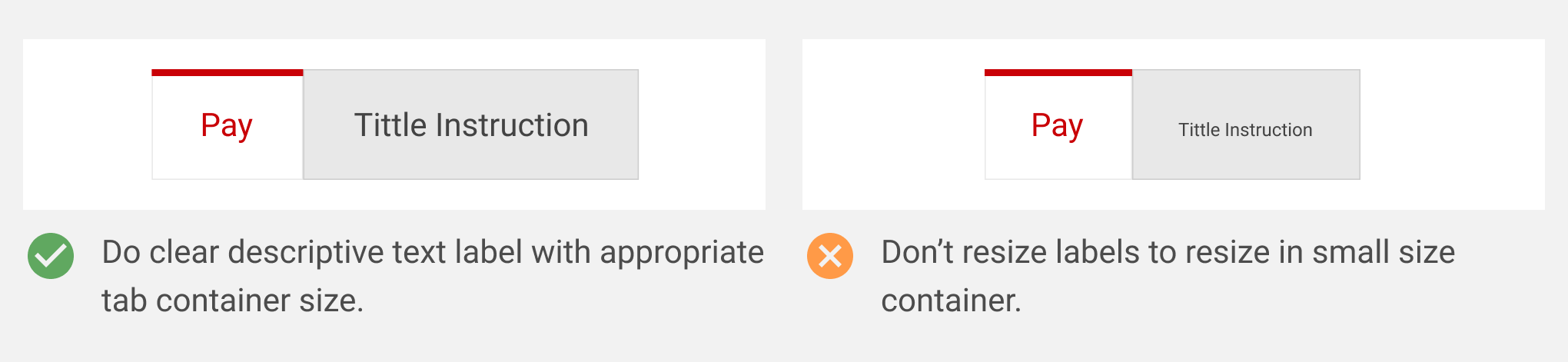
Text labels should clearly describe the content of the Tab they represent. If a label is too long to fit in a single line, don't resize the text; instead, wrap the text to the second line, use truncation, or consider using scrollable tabs.