Tooltips
General Guidelines
Vital information should't be hidden
Information that is vital for task completion should not be hidden inside a Tooltip. Tooltips are best when they provide additional explanation for a form field, icon, or other element that could be unfamiliar, or when they provide clarity for a request that can seem unusual.
Brief and helpful content
The content inside the Tooltip should be brief and helpful. Tooltips with obvious or redundant text are not beneficial to users. If you don't have particularly helpful content, we shouldn't offer a Tooltip. Additionally, content that is too long is no longer a "tip", so keep it short.
Unlabeled icons should have a Tooltip
Some icons have some level of ambiguity, or they are just unrecongnizable, so provide users with a descriptive Tooltip if there is no label for those kinds of icons.
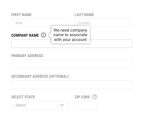
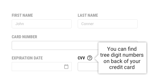
Informational Tooltip
There are two types of informational Tooltips. The info and help tooltips. The difference between those two tooltips is that info should provide additional tooltip is used to assist users in scenarios when they might ask what or where they can find the requested info.
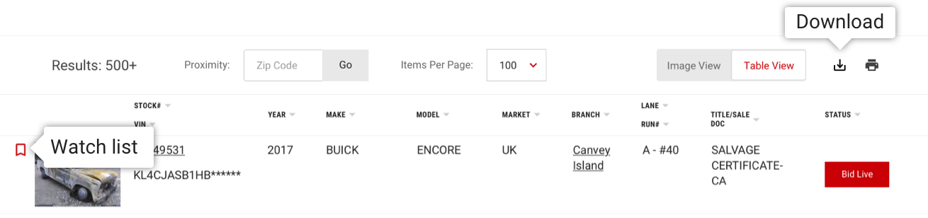
Icon Tooltip
An Icon Tooltip is used to clarify the action or name of an interactive icon button. The Tooltip content should only contain one to two words.
Location Options
The location of the popover can be customized to accommodate where the trigger element exists. The default position is right.
| Position | Attribute |
|---|---|
| Left | data-placement="left" |
| Right (Default) | data-placement="right" |
| Top | data-placement="top" |
| Bottom | data-placement="bottom" |