Contextual Alerts
General Guidelines
Contextual Alerts serve a similar function to standard alerts but are generally preferred when less visual impact is needed in the UI. They are a helpful way to create visual hierarchy for important callout information.
Anatomy
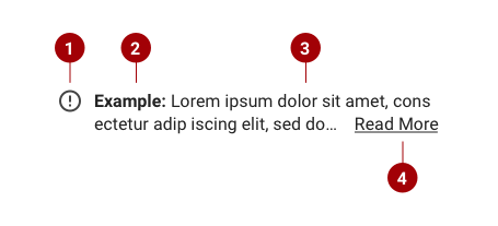
Contextual Alerts are typically made up of the following elements. At the minimum, each alert should contain at least an icon and supporting text.
- Icon - Must be included and should represent the type of alert. See usage below.
- Lead In (Optional) - Not required, but it is best practice to include this. Should be limited to one word.
- Supporting Text - The body text of the alert. Should be concise and limited to one or two lines.
- Text Link (Optional) - Links can be included. Do not wrap links across multiple lines.
Layout
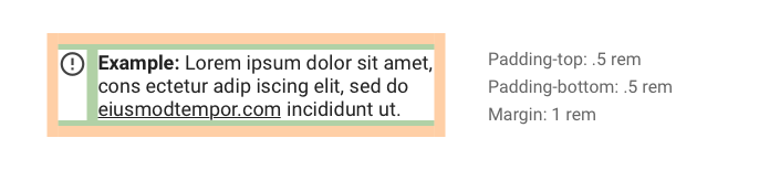
Please consider the following guidelines for container layout.
- Use consistent padding and margins for all Contextual Alerts.
- Icon should always be center aligned to the top text row.
Placement
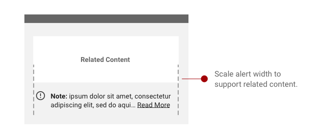
- Contextual Alert width should scale to fit it’s supporting text.
- Typically, Contextual Alerts will be placed below their related content.
Icons
Icon Sizing
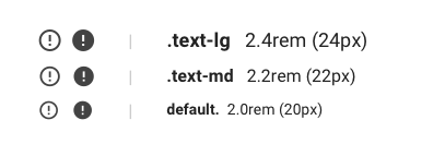
Icon size should scale with typography classes. Please refer to the chart below.
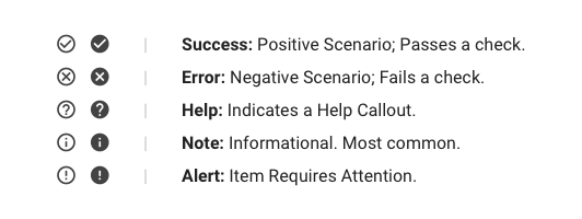
Icon Scenarios
The following icons will act as guidelines for specific scenarios. Custom icons may be used, but sizing and shape guidelines must be followed.
Icon Colors
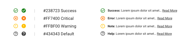
- Follow Established IAA Color Guidelines.
- Icons can be either Default Black (#434343) or colored as above if more visibility is required.
Links
Do's and Don'ts
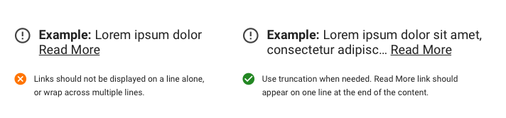
- Read More can be used to link to additional content. Use underline case, and truncation if needed.
- Text Links can be included in the body of the text. Do not wrap Links across multiple lines. Must be underlined.
- “Read More” should not be on a line by Itself.