Footer
Overview
The following components: links, iconographic logos, badges, global settings, and static content. The footer's aim is to provide users with:
- a second chance to find content they weren't able to locate in the global header.
- a location for content that is conventionally located at the footing of an application.
General Guidelines
Positing
- Footers should never be fixed.
- The footer block should display below body content and at the bottom of the viewport.
- Content should be prioritized left to right (oriented based on the language’s character direction).
Types
| Name | Desciption |
|---|---|
| Default |
contains standard supplemental content that’s rarely used by the user, but is necessary to maintain legal compliance |
| Expanded |
prepends the default header with content including links to internal IAA features, external IAA products, and social media profiles |
Anatomy
Default

Note that the above footer border example is presented to distinguish the footer from background and isn't used in production
- Brand Logo - builds brand recognition and protects the trademark
- Copyright info - inform visitors of the company’s legal standing
- Terms of Use - includes details regarding what a visitor agrees to by visiting the site
- Privacy Policy - explains what information IAA collects, how it's stored and how it may be used
Expanded
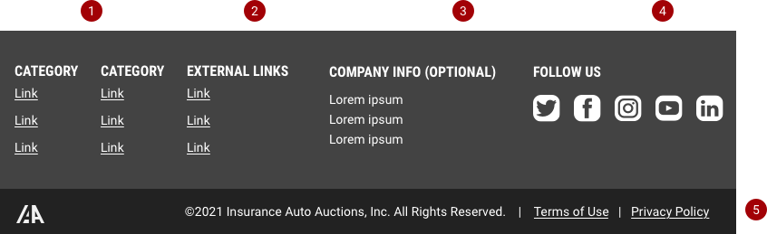
- Internal Category Links - quick links to utility features and secondary tasks
- External Category Links - access to external IAA products
- Company Info - contact information including address, phone number, and email
- Social Media Profiles - links to social accounts to offer users an alternative space to get to know the company
- Default Module - must always append the components 1- 4
When to use
Variants
When choosing a color scheme for the footer module, aim to match the body and header’s scheme. Matching the body/canvas helps maintain the low visual impact that it should have with respect to the rest of the application.
Example of light footer
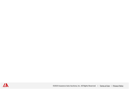
A light interface theme leads to the use of light footer variant with IAA’s brand logo color.
Example of dark footer
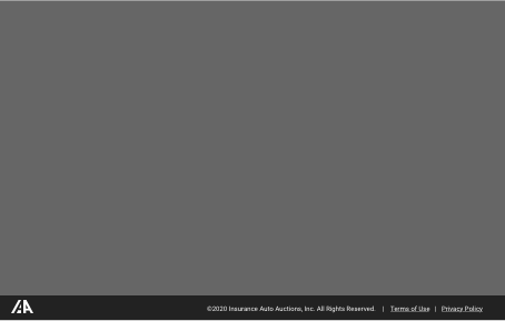
A dark interface theme leads to the use of dark footer variant.