Onboarding
General Guidelines
When to Use
Onboarding uses an enhanced version of our traditional Modal, and should be used to introduce new content or features to the user. For this reason, it is recommended to be displayed at the entry point to an application or specific feature in order to provide high visibility to that particular topic.
Walkthrough Modal vs Highlight Modal
The Walkthrough Modal is a good choice for long content since it provides the most real-estate. We want to use the Walkthrough Modal to display clear images of a concept with supporting text. This approach is preferable when introducing a feature or changes to an existing flow within an application.
Since the Highlight Modal serves contextual information to the user about the interface, it is better for smaller updates. This approach is best for demoing new interactions to the user since we can spotlight individual UI elements, which helps to walk the user through how to use them.
Walkthrough Modal
Anatomy
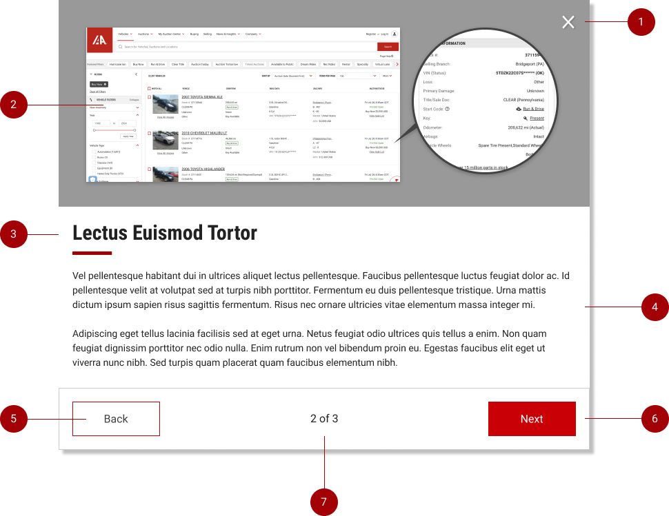
- Close Button: Since the Onboarding Modal is informational only, we do not want to stop users from navigating quickly away if they choose not to engage with the content. For this reason we should also provide a close [X] Button on the top right.
- Example Image: Onboarding modals should contain an example image clearly showing the concept they are trying to convey. This is a chance to show users the new feature we are introducing.
- Onboarding Title: Located at the top of the content area. Should be concise but clearly indicate the overall theme of the content. The title should be engaging and draw users in to read the additional information.
- Content Block: This area is used to describe a new feature to the user and should contain supporting text. Content should be broken down into bite-sized portions and grouped by page (indicated on the bottom of the modal).
- Back Button: The user should always have access to a “Back” button when navigating through the content. this will allow them to go back and review any content they may have missed.
- Next & Call to Action Button: The primary button on the modal should be the “Next” button, and clearly guide the user through the content pages. On the final page, the “Next Button” should convert into the Primary Call to Action. This will reinforce muscle memory for the user, and clearly indicate to them what action should be taken next.
- Page Counter: The page counter should in between the action-bar buttons, and offer a quick visual for the user to know what page they’re on, and how many are included in the Onboarding Modal. For best practice, Onboarding Modals should not contain more than 5 total pages.
Dismissal
The Onboarding Modal may be dismissed in 3 ways:
- Using the “X” button in the top of the Modal.
- Pressing the ESC key.
- Clicking / touching outside of the Modal area.
Feature Highlight
Anatomy
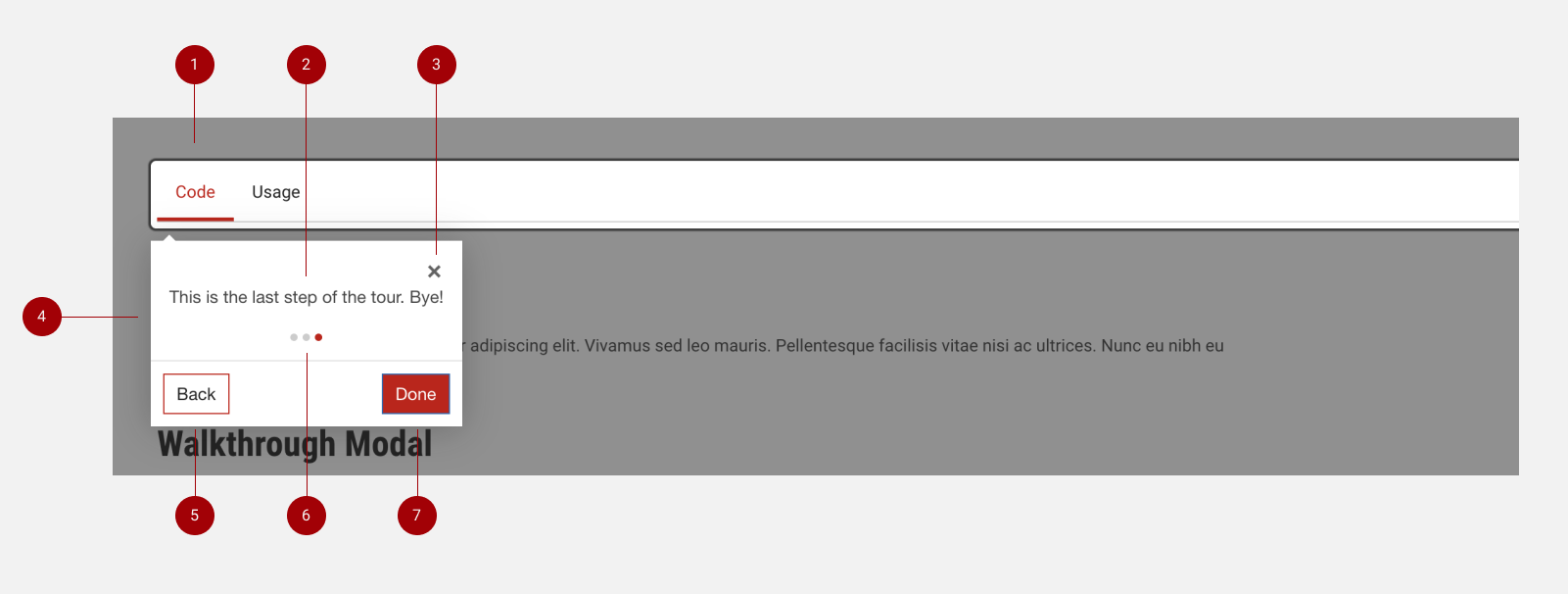
- Highlight: The Highlight offers full contrast & visibility to the feature in question. Since the rest of the interface has the dark modal overlay, this allows the user to focus on specific UI elements without distraction.
- Content Block: This area is used to describe a new feature to the user and should feature supporting text. Content should be broken down into bite-sized portions and grouped by page (indicated on the bottom of the modal).
- Close Button: Since the Highlight Modal is informational only, we do not want to stop users from navigating quickly away if they choose not to engage with the content. For this reason we should provide a close [X] Button on the top right.
- Highlight Container: This houses the content and will adjust position in order to be adjacent to the Feature Highlight, similar to IAA Tooltips.
- Back Button: The user should always have access to a “Back” button when navigating through the content. This will allow them to go back and review any content they may have missed.
- Page Counter: The page counter should span the bottom of the Content Block, and offer a quick visual for the user to know what page they’re on. This will be represented visually by dots, with Red indicating the current page view. For best practices, please do not include more than 5 content pages.
- Next & Done Button: The primary button on the modal should be the “Next” button, and clearly guide the user through the content pages. On the final page, the “Next Button” should convert into the “Done” button, which will close the Feature Highlight.
Dismissal
The Feature Highlight may be dismissed in 4 ways:
- Using the “X” button in the top of the Modal.
- Using the “Done” button in the footer of the Modal.
- Pressing the ESC key.
- Clicking / touching outside of the Modal area.