Panels
Format
Height
The panel should take up 100% of the height of its parent container. In most cases, that would be the viewport or main stage of your application.
Width, Structure and Form
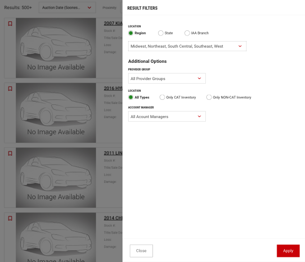
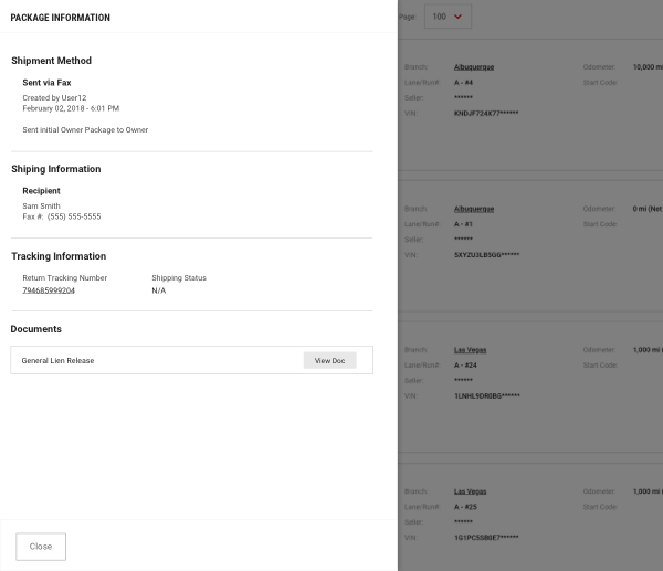
Panels should reflect the same form and structure as modals. They also share the same width options as modals. Refer to the Modals component for details.
Usage
Right Side Panels
Use Right Panel when displaying actions that don't require content from the primary canvas.

Left Side Panels
Use Left Panel to display item details.

Size
Panels have different sizes available to cater to different types of content that needs to be displayed. Below is a summary of the different sizes along with the additional classes that are applied to the <div class=modal-dialog> element.
| Size | Max. Width | Code Differentiation |
|---|---|---|
| Standard | 64rem/640px | No Class Required |
| Small | 48rem/480px | modal-sm |
| Medium | 76.8rem/768px | modal-md |
| Large | 96rem/960px | modal-lg |
| Extra Large | 120rem/1200px | modal-xl |