Header
Overview
A global header is what users rely on to navigate and orient themselves in the application. It is the foundation for introducing the product’s local navigation while also providing access to system-wide functions like settings, notifications, and app-wide search.
When to use
As one of the primary orientation points of a page, all IAA products should feature a header. The header should be paired down to just the necessary elements for the application that you are building. Please see the formatting section below for additional guidelines.
Placement
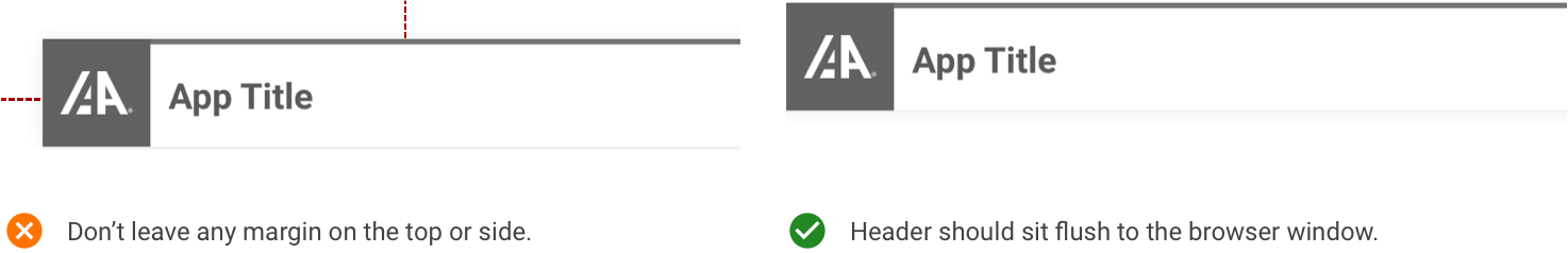
The header should be at the very top of the page’s main content area and should remain there. Depending on the application, it may or may not be fixed to the top, allowing for visibility during scrolling.
There should be no top, left, or right margins, and the header should be flush with the browser window. Please leave a space of at least ~2rem underneath the Header bar to allow for content to be displayed comfortably.
Navigation Options
The header component is based on a modular design and should be flexible enough to offer the right navigation experience for the user. With that in mind, here are the primary types of navigation.
| Header Type | Description |
|---|---|
| Inline Navigation Header | Utilizes inline links and sub-navigation on the primary bar |
| Slideout Navigation Header | Houses navigable elements within a menu icon. This is more condensed |
It is important to note that these navigation elements can also be combined to suit the needs of your application. For instance, you may wish to use a slide out menu for the majority, and one or two inline links or a sub menu to highlight key pages. Please refer to the examples below to help determine which style is right for your project.
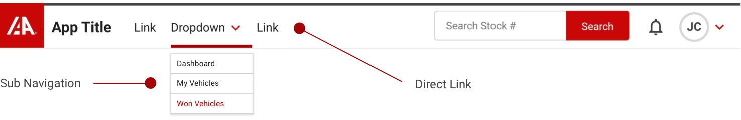
Inline Navigation
Inline navigation is an example of using the header toolbar space to place direct links and sub navigation menus. This can be helpful when you have a limited number of pages in an application, or if you wish to place more importance on a navigation element.
Placing links and sub-navigation on the top of the page gives the opportunity to highlight specific pages and features of the website, which may be especially useful for new users or guests. For this reason, it is the primary means of navigation utilized on IAAI.com.
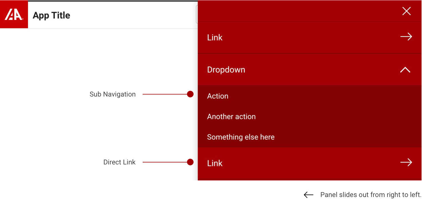
Slide Out Navigation
Slide out Navigation offers a more condensed menu which may be useful for applications with many links. Placing the nav elements together under a menu button keeps all pertinent items readily available to the user while minimizing the clutter and visual impact they have on the toolbar itself.
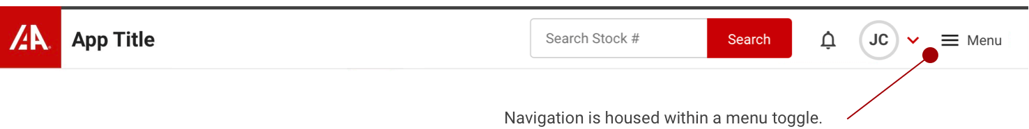
The slide out menu utilizes IAA’s branding color along with high contrast white text to help provide more visual focus to the navigation items. The panel will slide out from right to left as its name implies and will remain docked on the right edge of the browser window until dismissed, or until the user makes a selection.
Formatting
Anatomy
Each Header is made up of the following items, most of which can be removed individually, or combined as needed for your project. At the most basic level, every header must include at least the IAA logo (1), along with the Application Title (2).
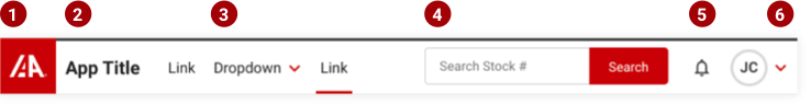
- IAA Logo - Follow IAA logo usage guidelines. This generally acts as a return to the home page or primary screen.
- Application Name / Title - Displays the top level Product Name or title. Be concise.
- Sub-Navigation Dropdown - Used to house a collection of related links via a nested dropdown menu.
- Application Search - Provides application or site-wide search functionality.
- Notifications & Alerts - Keeps the user up to date with important information and alerts.
- Profile Sub Menu - Contains user specific actions and details such as ID, profile, logout, etc.
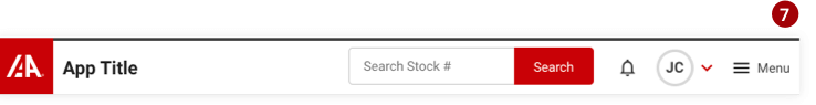
- Slide Out Menu - This button houses a nested, stacked list of navigation links.
Profile Sub Menu
If user authentication is required (sign in) you will also want to include the profile sub menu.
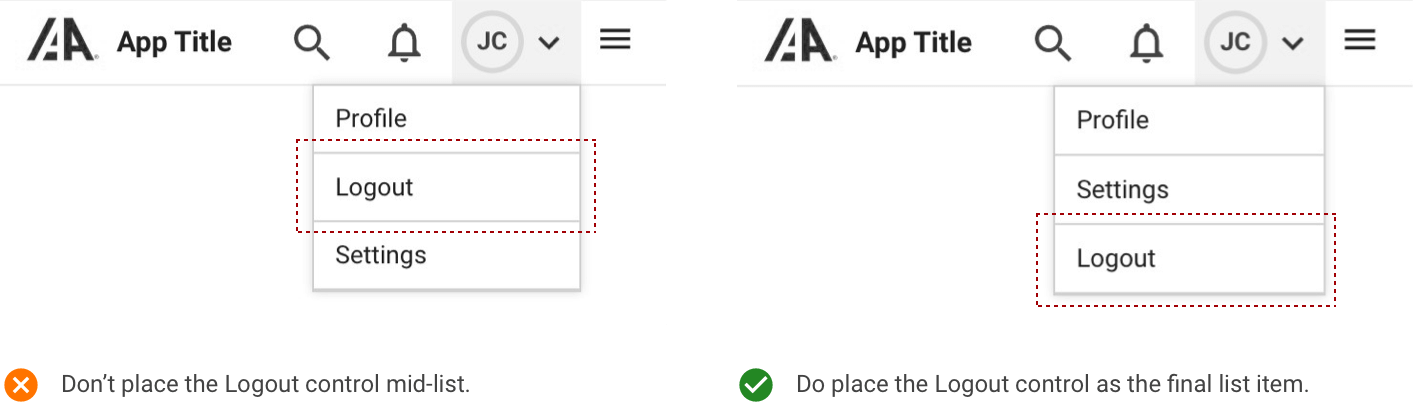
The profile sub menu helps to collect relevant actions that are specific to the user within a simple drop down control. For example, this is a convenient place to locate the user profile link, along with specific application settings and an application Log Out control.
Links and user specific actions can be added to the Profile Sub Menu, but please maintain consistent hierarchy within.
Application Search
A search control is typically included in the header toolbar to offer site wide search capabilities. This component offers a convientient way for the user to quickly find what they are looking for, without neccesarilly knowing how to navigate directly. The search bar should be the left most aligned element on the right-hand side of the toolbar.
Search should offer a hint as to what type of data is searchable inside the input field and should also offer smart suggestions or recent searches to help guide the user.

Once you reach tablet and mobile breakpoints; the search component should minify to allow for the lack of space. Replace the search bar with a search icon toggle.
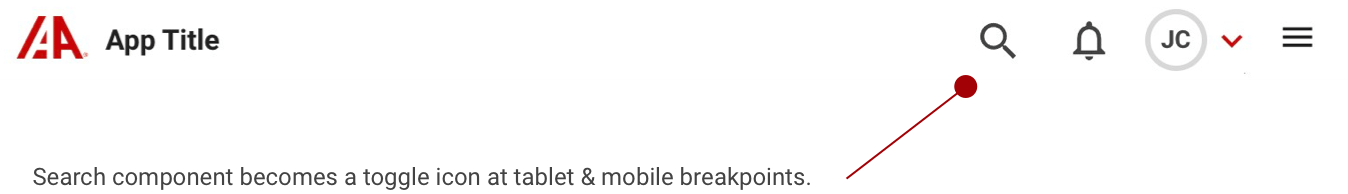
To maximize real estate in this smaller view, the toggled search bar should take up the entire header toolbar in a focused view. This view can be dismissed at any time by clicking or pressing on the X button to the right.

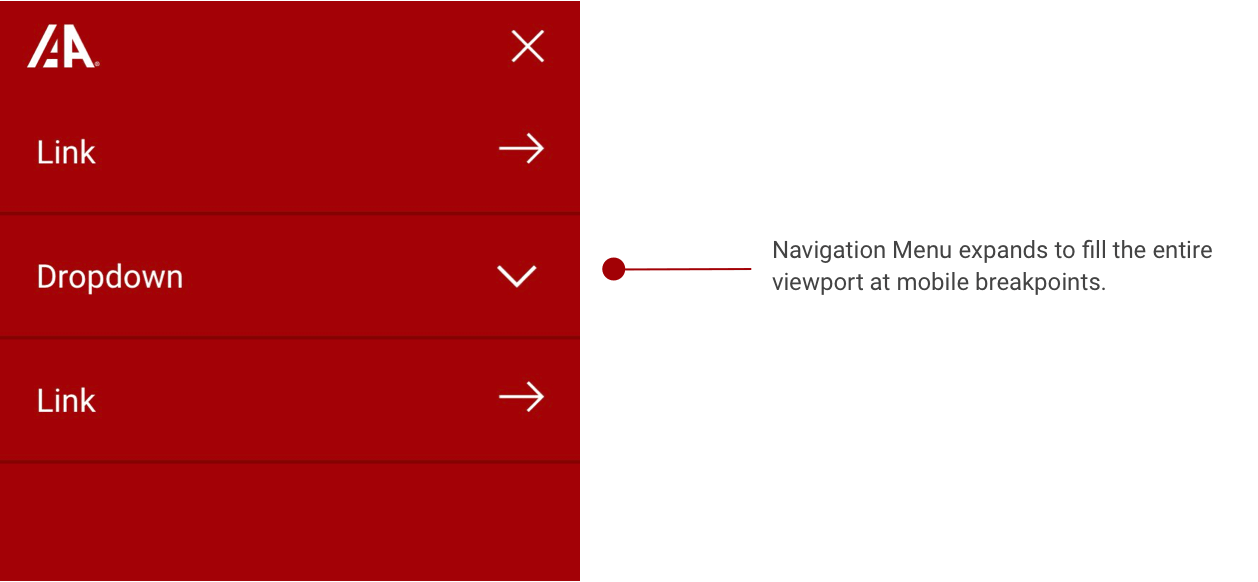
Mobile Layout
Both Inline and Slide out Navigation Headers are configured to be responsive at mobile breakpoints. Several of the navigation components have been optimized to make use of the limited space. For example, the IAA Logo flips to Red over White to allow for better contrast and visibility at smaller sizes.