Forms
General Guidelines
Keep It Short
Be as concise as possible when designing Forms.
Begin By Asking
- What do you gain by collecting this information?
- Is this a piece of information that is valuable to us?
- Is this a piece of information that is so valuable that it's worth preventing the user from continuing if they choose not to provide it?
Labels
Effective form labeling helps users understand what information to enter into a Text Input. Using a placeholder text as a label is often applied as a space-saving method. However, this is not recommended because it hides context and presents accessibility issues.
Default Values
Where possible, add programmatic assistance. Detect and pre-fill inputs to reduce errors and save time. When the software can't determine the value that belongs in an input, use type-ahead to make suggestions. Use sentence-case for default values, detected values, and auto-completion text.
Help Text
Help text is pertinent information that assists the user in completing a field. Help text is available via the Tooltip component. The help text is indicated by the “information icon”. Use sentence-style capitalization, and in most cases, write the text as full sentences with punctuation.
Placeholder Text
Placeholder text provides hints or examples of what to enter. Placeholder text disappears after the user begins entering data into the Input and should not contain crucial information. Use sentence-style capitalization, and in most cases, write the text as a direct statement without punctuation.
Anatomy
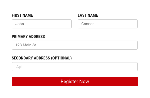
Designing Forms requires making decisions about structure, interface elements, field labels, help text, validation, etc. Forms can be one or two columns. The width of each column varies based on the content and layout of the design. On mobile, the suggested form design is one column with an exception where ZIP code can be combined with State selection or any other shorter selection. All Forms are comprised of 6 elements.
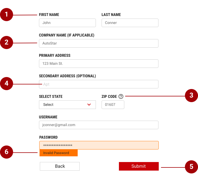
- Labels - Inform users what the corresponding input fields mean.
- Input fields - Enable users to provide information. Information can be entered through a variety of different input fields ranging from text fields, checkboxes, and many other types.
- Help text - Provides assistance on how to fill out a field. Help text is optional.
- Placeholder text - Each row may have an inline action which is always placed the far right column.
- Actions - Allow users to submit a form.
- Validation - Ensures the data submitted by the user conforms to acceptable parameters.
Choosing the right component
Forms can contain several different components. The order in which these elements are arranged is flexible and depends on the purpose of the form. Think about each field and what value the data will provide.
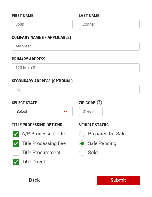
- Text Input is used when the expected input from the user is a single line of text. Follow the guidance for the text input component in the usage section.
- Dropdown is used when the user needs to make one or more selections and there are a large number of possible options. If there are less than 4 options consider using checkboxes. Follow the guidance for the dropdown component in the usage section.
- Radio Buttons are used when there is a list of two or more options that are mutually exclusive and the user must select exactly one choice. In other words, clicking a non-selected radio button will deselect whatever other button was previously selected in the list. Follow the guidance for the radio buttons component in the usage section.
- Checkboxes are used when there are lists of options and the user may select any number of choices, including zero, one, or several. In other words, each checkbox is independent of all other checkboxes in the list, so checking one box doesn’t uncheck the others. A stand-alone checkbox or a toggle can be used for a single option that the user can turn on or off. Follow the guidance for the checkboxes component in the usage section.
Button placement on Forms
Primary CTA (confirmation, submit buttons, etc.) should be always right-aligned on Forms. Buttons should align with the form controls regardless of the user’s window width. To go Back or Cancel process buttons should be left aligned.
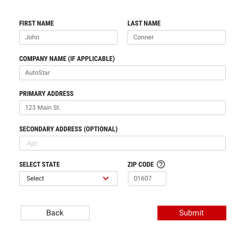
Pairing input fields with buttons
Buttons on Forms are the same width and height as input fields in case there is only one primary action. Follow the guidance for the text input component in the usage section.
Validate & Errors
Error messaging
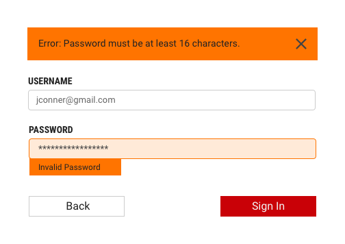
Effective error messaging can help the user to understand the problem and how to fix it. First, inform the user what has happened, then provide guidance on next steps or possible resolutions. Inline Notifications can be used to state the general problem with the users input, such as “Please input the required fields.” Inline Notifications can occur pre or post submission, depending on the type of data the user is inputting.
Form validation
Validating the users data before form submission. Use visual cues to guide the user as to where the problem lies within the form. This will help to easily identify the elements that need to be corrected.
The validation should appear when the user has clicked away from the text field. Once the user corrects the errors within the text field, the validation should disappear once the data is rendered as valid.
The validation label below the field should be as informative as possible when describing the issue with the users data. For example, if password limitations require 16 characters, but the user inputs a password with only six characters, the text should read something like, "Password must be at least 16 characters."
Optional vs. required fields
All fields in a form are assumed required, with optional fields being tagged as so.
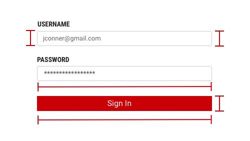
Input field sizing
The IAA design library contains sizing variations for buttons, input fields, dropdowns,
and text fields. There are small, medium, large, and extra-large sizes for form
elements. You should always be considering form elements at least in the medium
size (40px height) when designing for mobile screens. These elements should be
paired with medium size buttons (see above section Pairing input fields with buttons).
There is some flexibility while designing for bigger screens. Based on layout and
content on a page choose the size of form elements that will provide the best
hierarchy.
Follow the guidance for the buttons component size in the usage section.